

accessible for all ~
accessible for all ~
I’m passionate about digital accessibility as a means toward creativity versus compliance. My work prioritizes content creation that is inclusive as much as strategic.


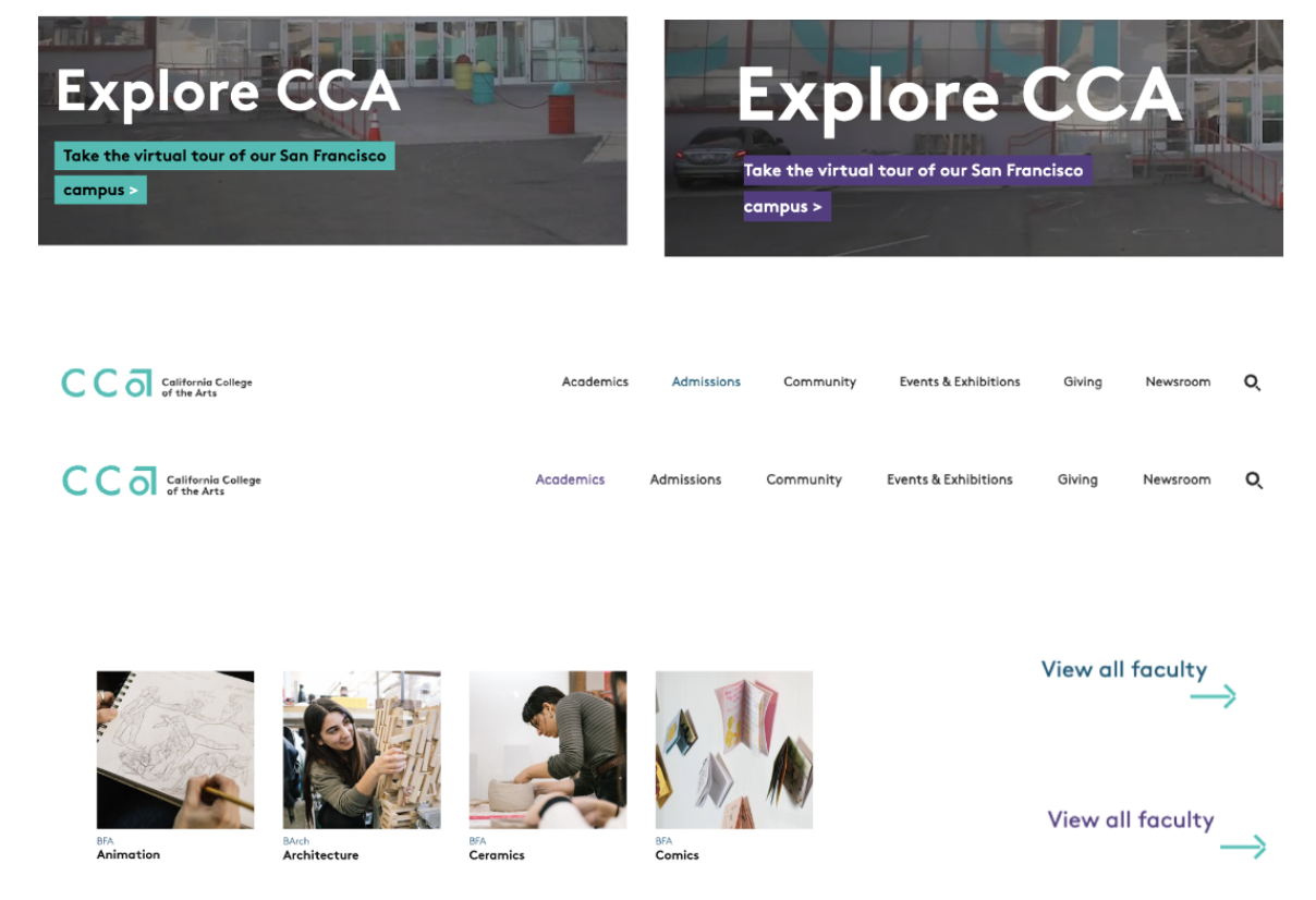
Color contrast
Complementing CCA’s brand with inclusivity

Solution by design
CCA’s brand teal on cca.edu did not pass WCAG accessibility standards (AA and AAA). The web and design teams found a design solution that worked within our brand and better served our site visitors.


A secondary color—navy—was added into cca.edu’s visual language. It passes all color contrast tests and is analogous to the brand teal. Across the site, we also implemented a consistent active state of purple.


An inclusive tour

Before
~ No alternative text
~Separate interface for “accessible version”
~ Automatic video and audio play


After
~ Alt text on images and videos enabled
~ One aesthetic and inclusive experience for everyone
~ Designed and developed with WCAG Guidelines 2.0